I've written before about the tradeoff most workforce planning teams seem to eventually run into: plan at an aggregated FTE level and lose all the compensation nuance, or plan at the named-employee level and the spreadsheets grind to a halt the moment they have to hold a real org's worth of rows (and besides, the higher-ups wanted a higher-level overview of things rather than being bogged down by information at the employee-level). Most teams just pick pick whichever fits their setup best.
Our team wanted the pros of both low and high granularity, so we spent a while figuring out how to get the precision of a named-employee model, without the performance hit. With that in mind, we designed a 4-layer structure that, while not perfect, has held up well enough that I think it's worth writing up properly, rather than just the quick version I posted in the forum a while back.
In short, we had four questions to answer:
The model has four connected layers, each answering a question and feeding into the next, from individual employee compensation, all the way to a consolidated view of our entire workforce and cost position for the year ahead. We specifically wanted the model to be connected, so the answers to those questions also link up. I'll explain about those layers in more detail in this blog.
I'm not one for spoilers, but the granularity tradeoff mentioned earlier gets resolved layer by layer, rather than all at once. Layer 1 holds the highest-resolution data we have, since that's where we plan for our current employees (real people tracked monthly). But as far as potential hires are concerned we're no longer talking about named individuals, since the people who'd fill those seats don't exist yet. So the subsequent layers work off Layer 1's numbers, aggregated up to the role and department level. Basically, we connect the layers and roll up where needed, not because we're sacrificing detail, but because that's the most detail the layer can actually support.
Let's walk through the model.
The baseline starts with the highest level of granularity: employee-level, month-level precision. Rather than working with high-level department averages, each active employee is tracked monthly across discrete cost drivers: base salary, variable bonus, benefits load, and payroll taxes. This allowed us to be specific with the way we planned the salary structure for each employee as well, down to a monthly level (which tied in nicely with the pay cycle).
When an employee has a planned departure, their cost automatically tapers off after that month. This layer is maintained in PowerTable, since that module supports the large number of records we had (we had a row per employee per active month, which meant around 1.2M or so records). And, we used the Crosstab layout to maintain drillability as well. With this, we know how much our current employees would be paid, as well as how much headcount supply we'd have.
Layer 1 gives us the headcount supply. In Layer 2, we start off by having each headcount owner (basically anyone with a team under them, so team leads, managers, directors) submit the total FTEs they'll need for a given role, as well as why they'd need those folks. This is our headcount demand, and the resulting gap between supply and demand, is met by hiring new folks.
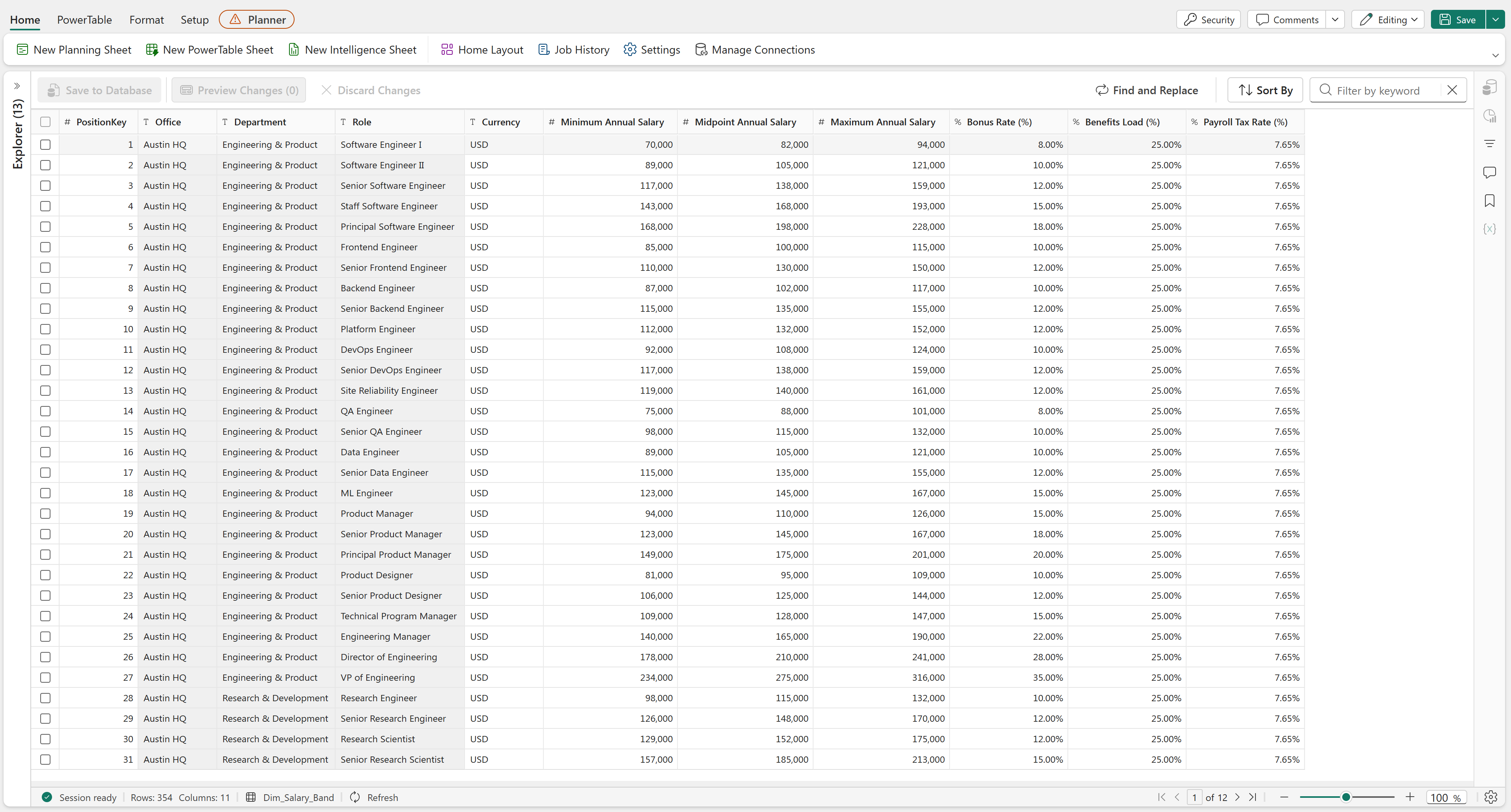
We used PowerTables for storing our reference tables for salary structure ranges and demand drivers:
We were keen on governance, and wanted to make sure headcount owners could formally substantiate the reasons they wanted the FTEs they did. We achieved this by having them fill out forms which were connected to a PowerTable, with each submission restricting driver selection based on the particular role (we maintained bridge tables for demand drivers and roles, in PowerTable too):
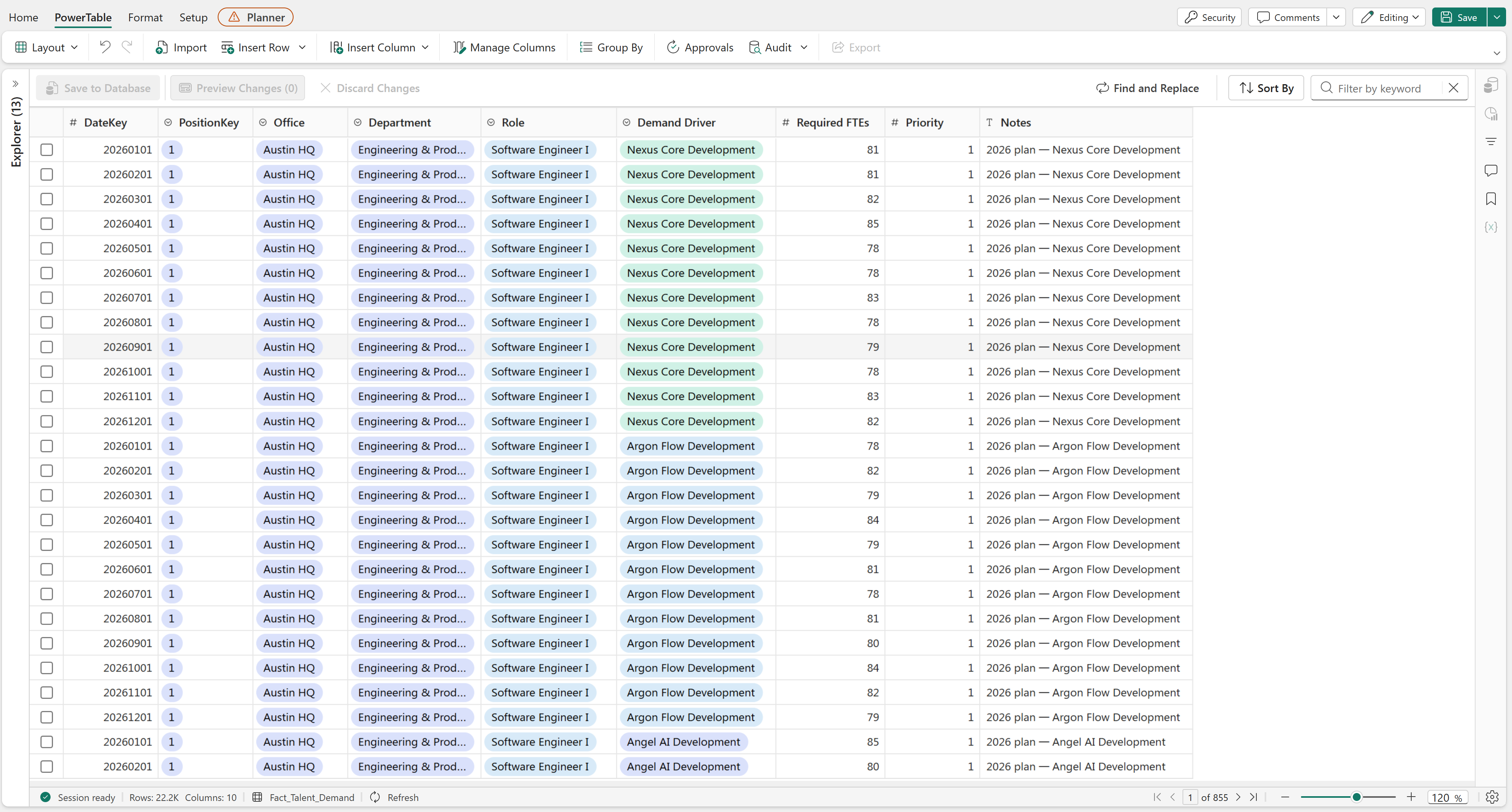
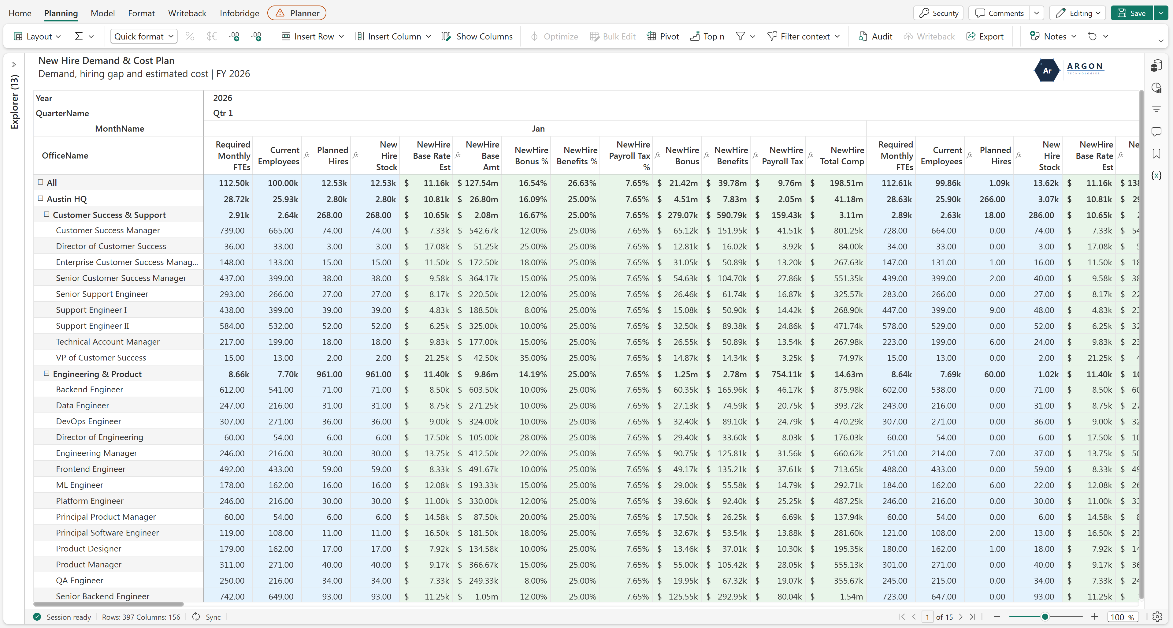
Next, we had a planning sheet that connected Layer 1's Current Employee PowerTable with this Layer's Demand Submission and Salary Reference PowerTables. We use formulae to evaluate the declared demand against existing supply and recent joiners, and automatically price the required hires:
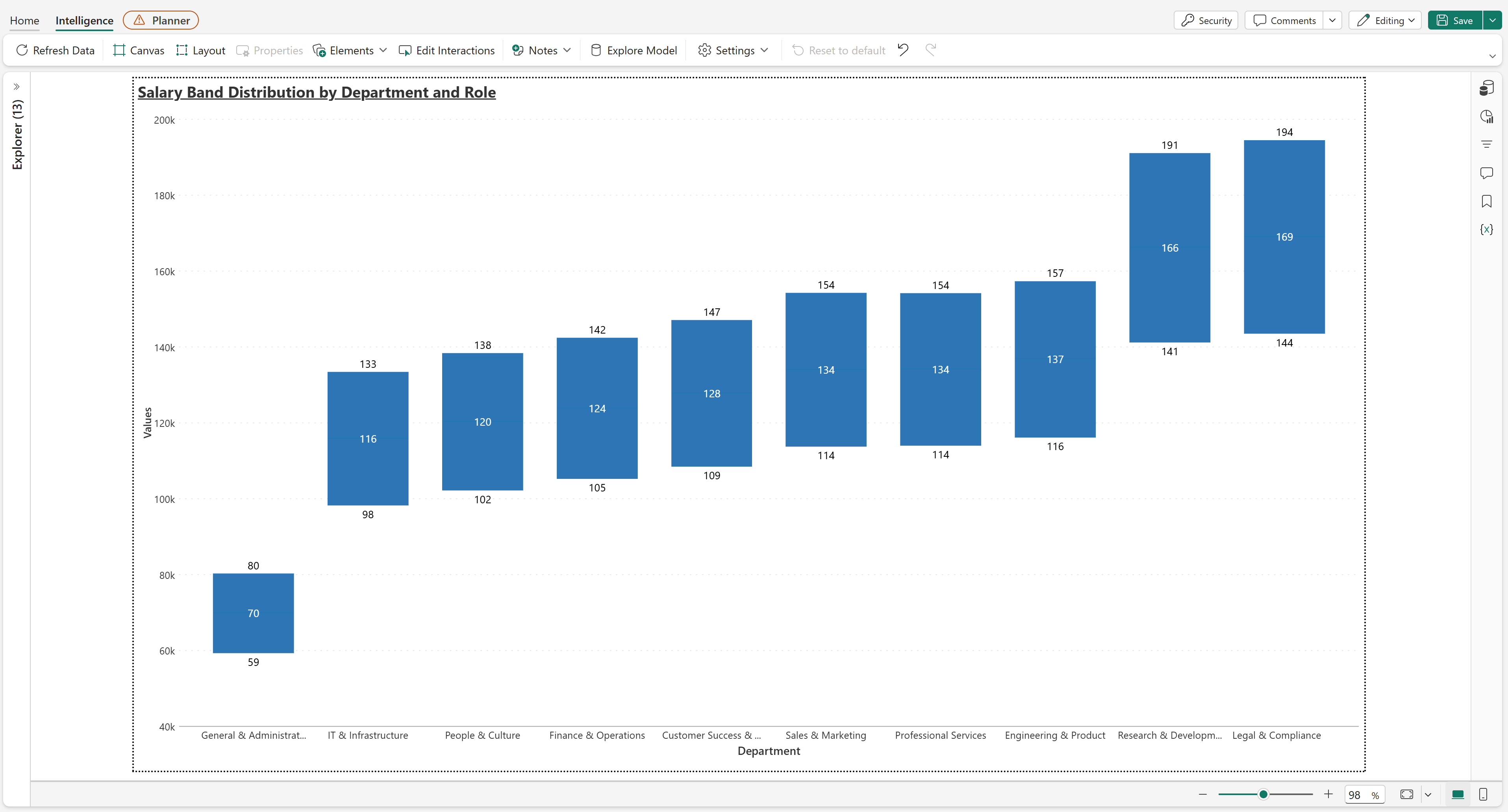
To wrap up this Layer, we also had a box plot chart which showed the way the min, mid and max points of each role's salary structure were spread out. We also had this drillable into the roles in each department:
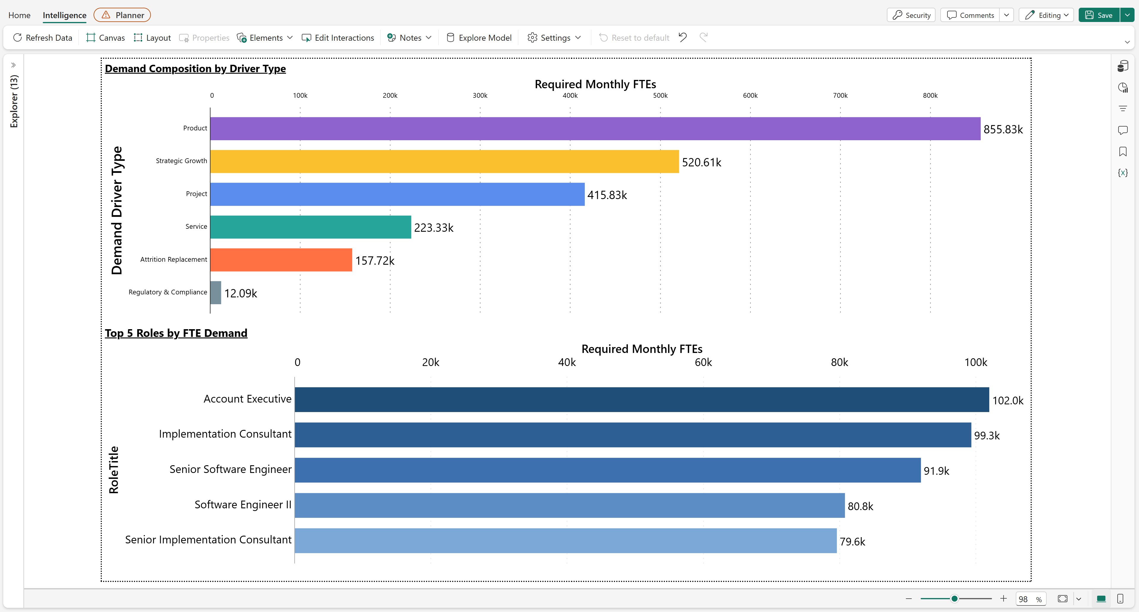
Alongside that, we also broke down demand by driver type and surfaced the roles carrying the most of it, which was useful for spotting whether a given period's hiring is mostly reactive backfill or actual strategic growth:
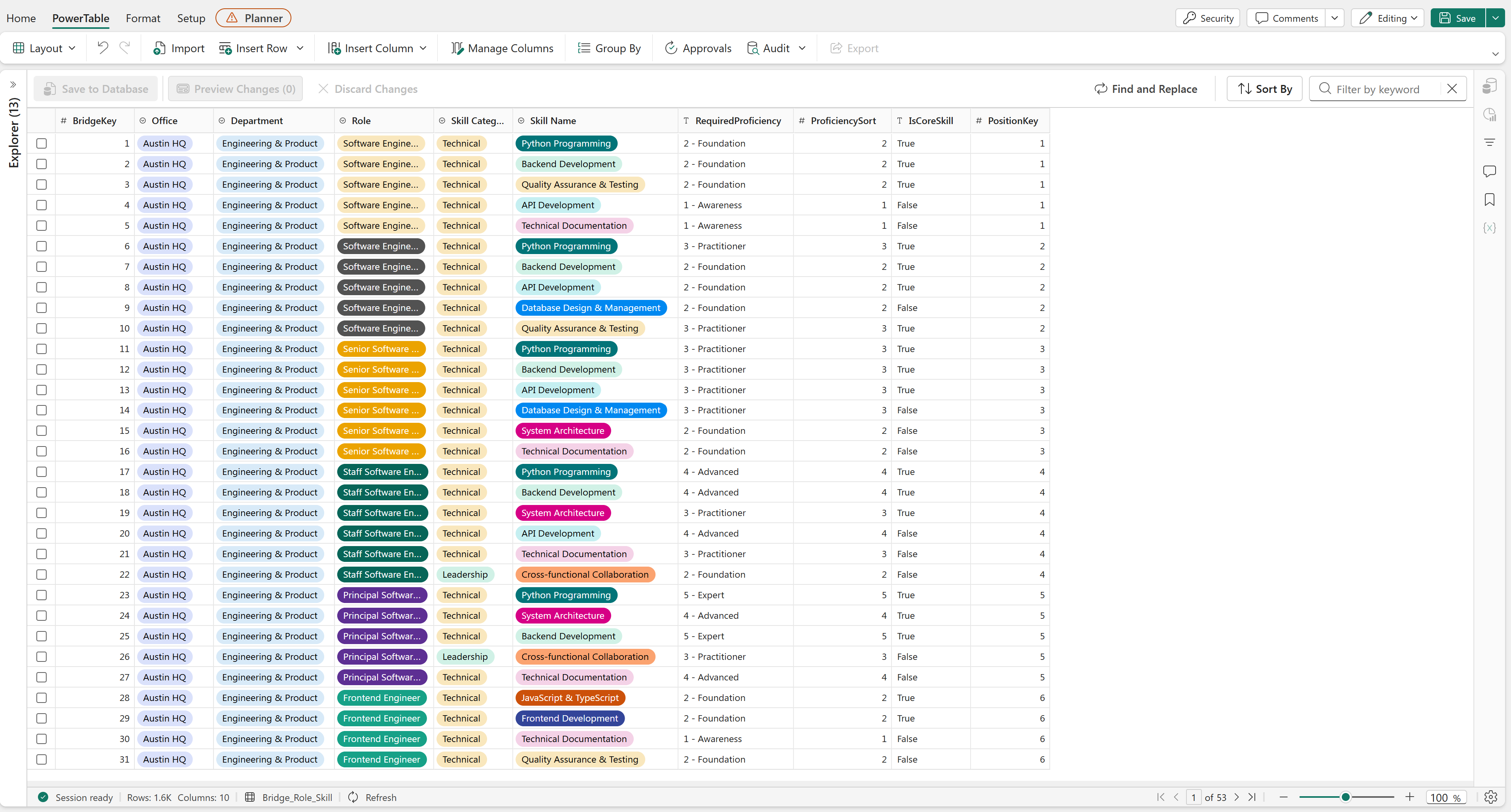
Back to the current workforce: Alongside just numerical headcount, we also wanted to monitor capability; how good each employee was at their role. We measure this, by having each role require a specific skillset (skillset being skills as well as proficiencies, so breadth and depth). PowerTables again for maintaining the reference tables, so we could map each role against standard proficiency benchmarks across five skill pillars (Technical, Functional, Leadership, Commercial, Delivery), using a 6-point scale from Awareness through Expert:
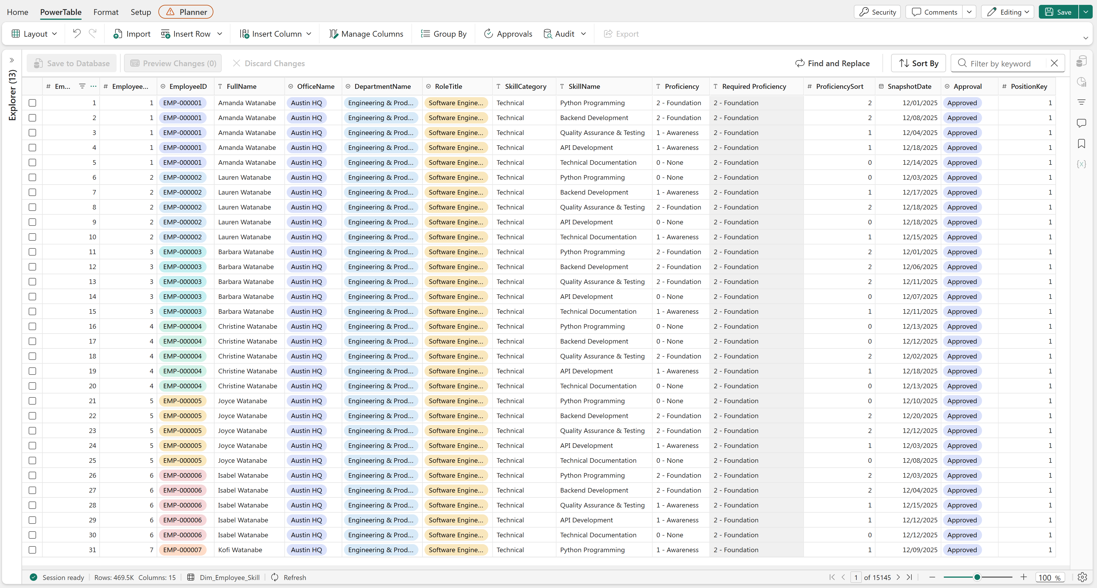
Headcount owners would use forms again to provide evaluations of their team members, which would flow through formal approval workflows before updating capacity metrics in a connected Planning Sheet (we weren't quite sure what formulae to use here, so we just used DAX):
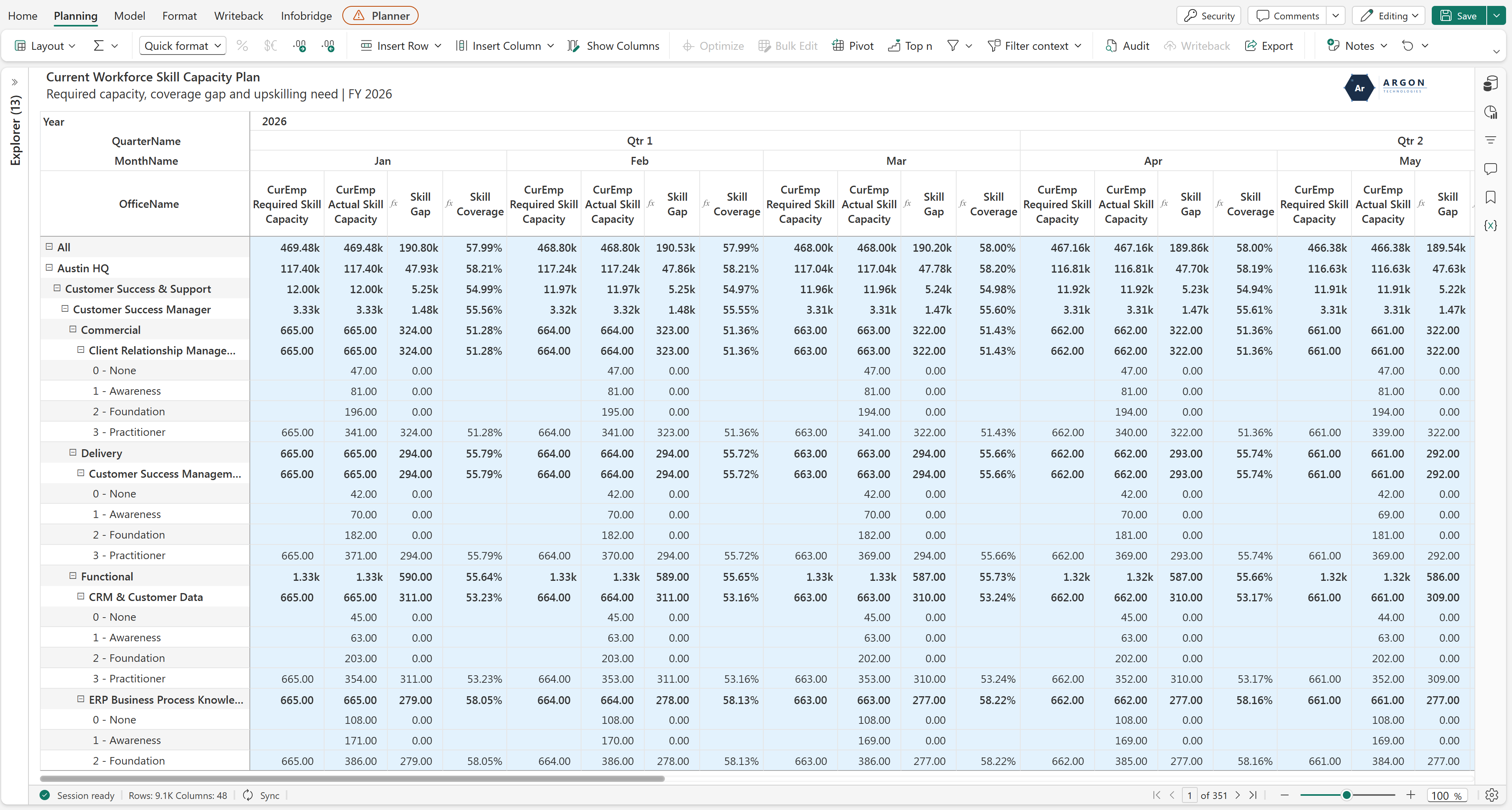
One metric gives us the benchmark while the other gives us the actual skill coverage, which would help us see which offices, departments and roles we need to drill into for upskilling:
We've also radar charts to highlight the average employee's skillset, against what their role actually requires.
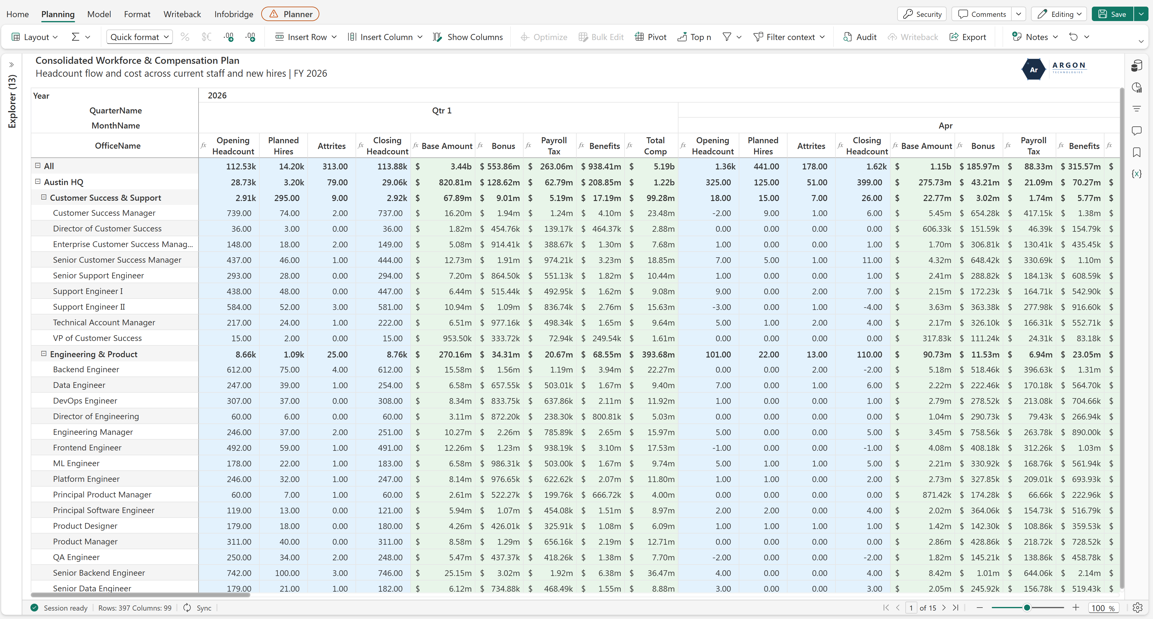
The final layer unites current staff, new hires, and departures into a single executive view. With Layers 1 and 2 connected, we've a clear visibility into headcount movements (Opening + Hires − Attrition = Closing), drillable across offices, departments and roles, across the full planning horizon at whatever hierarchy of YQM we choose (and of course, salary structure and total cost as well):
Was the ambition worth it? Yes, for the most part. We haven't phased out every spreadsheet in the process (a couple of departments still run side calculations we haven't fully folded into Layer 2 yet), but the core bet paid off. We get named-employee precision where it matters, aggregate speed everywhere precision doesn't apply, and none of it needs someone manually stitching four different sources together before a review. Well worth the initial setup time.
The part that's actually changed our week-to-week the most is that nobody asks “whose number is right” anymore. Compensation, demand, skill coverage, and the final headcount waterfall all trace back to the same four layers, so if something looks off, we know exactly which layer to go check instead of reconciling multiple spreadsheets to find it.
Thank you for reading this far. I posted the shorter version of this same question in the forum a while back, and if you're mid-way through building something similar, or you've got a finance team pushing back on named rosters, I'd like to compare notes in the forum.
Anyone who has run an annual planning cycle knows the standoff. Leadership looks at the market and hands down a top-down revenue target of 15% growth. Meanwhile, the department leads build their budgets from the bottom up based on actual headcount, pipeline, and capacity, and usually land somewhere around 8%.
Finance then spends the next three weeks living in spreadsheets, trying to negotiate the gap between those two numbers.
When you manage this in Excel, top-down and bottom-up planning usually live in completely different workbooks. You have a high-level target sheet for the executives, a granular operational sheet for the managers, and a variance tab trying to tie them together.
When you build your plan directly on top of your semantic model, you don't need separate workbooks for different planning motions. Because the grid understands your dimension hierarchies natively, it can handle both directions at the same time.
The trick with top-down adjustments is how you distribute the numbers down the hierarchy. Fabric Planning handles this through three distribution modes:
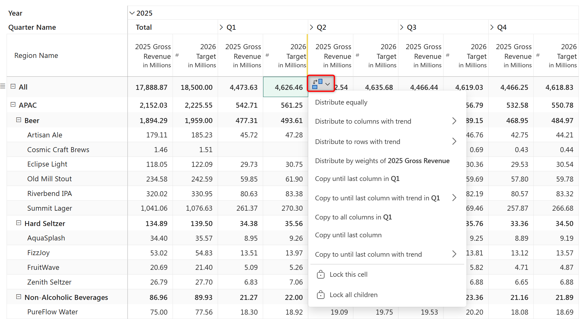
This dual-directional planning is a core capability of the platform, and it doesn't require writing complex DAX allocation formulas to set up. If you want to see how this works in practice, jump into Exercise E1 in the Fabric Planning training guide. It walks you step-by-step through configuring target spreading and aggregation on a real dataset.
Yes, because the planning grid understands your dimension hierarchy natively, a regional manager can enter values at the store or product level while leadership adjusts totals from the top. Both inputs coexist on the same sheet—bottom-up entries aggregate up automatically, and top-down adjustments distribute down based on the distribution mode you choose.
The most recent edit is retained. If leadership overwrites a regional total after a manager has already entered granular values, the distribution mode you select determines how the new total is pushed back down, potentially overwriting the manager's inputs. For this reason, many teams use locking to protect confirmed bottom-up entries before running a top-down adjustment.
Yes, Fabric Planning lets you lock individual cells or entire subtrees before triggering a distribution. Locked cells are skipped during spreading, so the adjustment distributes only across unlocked descendants.
No, distribution modes are handled directly within the visual interface. Equal, Weights, and Trend are available directly when you adjust a parent-level cell or select the distribution action. No custom DAX allocation logic is required.
Yes. You can enter an annual or quarterly top-down target across a time column and distribute it horizontally across months, either using equal monthly splits, a linear trend, or by applying the Weights mode against prior-year monthly actuals to preserve historical seasonality.
There is a running joke in FP&A that the annual budget is obsolete by the second week of February. Market conditions shift, supply chains delay, and suddenly a static 12-month plan is just a historical document we have to explain variances against.
Most finance teams know they should be moving to a rolling forecast, continuously forecasting four to six quarters out so leadership always has a clear line of sight. The roadblock is usually the administrative burden.
Managing a rolling forecast in a spreadsheet is a mechanical headache. Every time a month closes, someone has to go into the master template, hide the closed month, add a new month to the end of the horizon, update all the SUM formulas to capture the new range, and make sure they didn't accidentally break a cell reference. It is tedious, error-prone work that keeps analysts busy doing data entry instead of analysis.
The deeper problem is structural. A spreadsheet doesn't know the difference between a closed period with real actuals and an open period with assumptions. Every cell looks the same. Protecting closed periods from accidental edits requires manual locking. Extending the horizon requires structural changes to the file. And when assumptions need updating, there is no systematic way to reseed open periods from the latest actuals without rebuilding the model.
A rolling forecast built on a native planning platform works differently at the architectural level. Every period in the forecast is explicitly classified as either open or closed, and those two states behave completely differently:
It is also worth noting that a closed period can reference a different measure from the open period ahead of it. This means actuals and forecast can live as separate, clean measures — Gross Revenue for closed periods, Forecast for open periods — while the series remains continuous without a break.
This distinction is what makes rolling forecasting operationally manageable. Closed periods are facts. Open periods are assumptions. The system knows which is which.
In Fabric Planning, closing a month is a three-step sequence rather than a manual restructuring exercise:
For teams with sufficient historical data, there is a more powerful alternative to manual assumption entry. Fabric Planning's built-in Predict engine uses historical actuals to infer trend and seasonality automatically, populating the full forecast horizon in a single run.
The minimum history window is 24 months, with two full years of actuals, the model can isolate genuine seasonal patterns rather than mistaking single-year anomalies for structural trends.
One practical note on access: Predict is available in both reading view and edit mode. Analysts reviewing the forecast can run a statistical prediction without switching to edit mode — useful in organizations where most users have read access and edit access is reserved for a smaller group of planners.
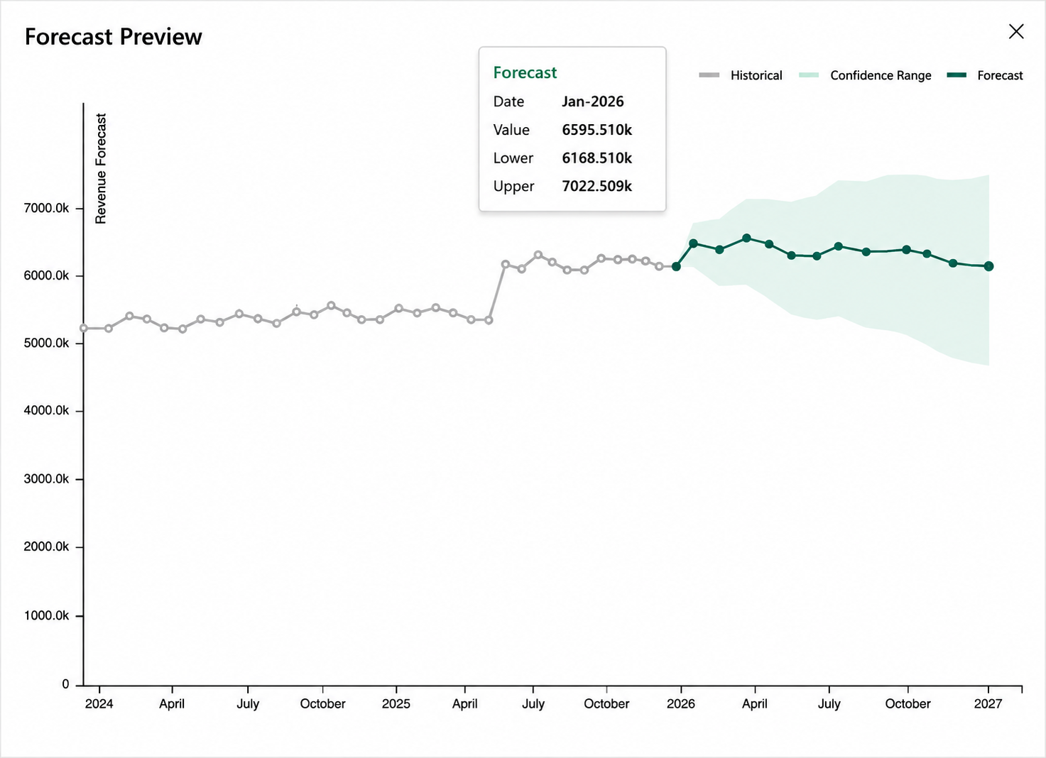
When the forecast runs, historical actuals render in grey and predicted values render in green, bounded by a confidence range showing the uncertainty band. The default confidence interval is 90% — the model is 90% confident the actual will land within the shaded band. Adjusting this percentage doesn't change the central forecast line, only the width of the uncertainty band shown in the preview. You can also layer a discretionary growth factor on top of the output — for example, adding a 4% market growth assumption on top of what the model predicts from history alone.
If you are not sure which algorithm fits your data, start with Auto ETS or Auto ARIMA. Both automatically test multiple configurations against your historical series and select the best-fitting one — no statistical expertise required. The table below is a simplified guide to the most common data patterns. For the complete algorithm reference, including all model orders and variants, see the Predict documentation.
| Data Pattern | Recommended Algorithm |
|---|---|
| Stable data with no trend or seasonality | Simple Exponential Smoothing |
| Trend only | Holt's Linear Trend |
| Trend gradually weakens | Holt's Damped Trend |
| Trend with constant seasonal variation | Holt-Winters Additive |
| Trend with seasonal variation proportional to the level | Holt-Winters Multiplicative |
| Multiple seasonal patterns | MSTL |
| Non-seasonal data with autocorrelation | ARIMA |
| Seasonal data | SARIMA |
| Unsure which ETS model to use | Auto ETS |
| Unsure which ARIMA model to use | Auto ARIMA |
Note: Auto ETS and Auto ARIMA are not limited to cases where you are unsure — they are valid choices for any dataset and a reliable default for most teams.
A finance team can move from a blank forecast horizon to a fully populated 12-month projection in a single step. When a period closes, the Reforecast action reseeds the newly opened month using the same statistical logic, keeping the rolling forecast active without a manual update cycle.
The monthly close transforms from a mechanical data-entry task into a review and judgment exercise, cutting forecast preparation from days to hours.
To see how to manage open/closed periods, run statistical predictions, and extend forecast range on a live dataset, work through Exercise E2 in the Fabric Planning training guide.
Hiding columns in Excel is purely visual, the underlying cells remain editable and vulnerable to broken formulas. In Fabric Planning, triggering Close Period permanently locks the closed time frame against data entry, replaces forecasted values with immutable actuals pulled directly from your semantic model, and recalculates downstream variances automatically. The distinction matters: hiding a column is cosmetic, closing a period is a governance action.
Future periods remain open and editable. When you execute Extend Forecast Range, the system appends the next forward period to maintain your configured rolling window of forward visibility — whether that's 12, 18, or any other number of months your team has set. You can then use Reforecast to seed that newly opened period from a reference source, such as prior-year actuals with an applied growth assumption, without rebuilding the grid layout. The trigger that locks an elapsed period is also configurable. Organizations running a consistent monthly close can automate the close action rather than triggering it manually from the ribbon each month.
They serve different purposes in the monthly workflow. Close Period is a governance action. It locks historical periods and commits finalized actuals from the semantic model. Reforecast is an assumption-seeding action. It populates open forward periods with baseline numbers derived from prior actuals, past forecast versions, or statistical models, so planners don't have to start from a blank slate. The two actions work in sequence: close the past, then seed the future.
Yes, a closed period can reference a different measure from the open period ahead of it. For example, closed periods can read from a Gross Revenue actuals measure while open periods read from a Forecast planning measure. The series remains continuous without a break, and actuals and forecast stay as separate, clean measures rather than being written into the same column. This is particularly useful for organizations that want to preserve a clear separation between actuals and planning data in the underlying Fabric SQL database.
Statistical models need at least two full annual cycles to distinguish recurring seasonal patterns, like Q4 retail spikes or summer demand dips, from one-off anomalies or baseline trend shifts. Running predictions with less than 24 months risks mistaking a single-year spike for a permanent structural trend, producing forecasts that overfit to noise rather than capturing genuine seasonality.
If you are uncertain, select Auto ETS or Auto ARIMA. The engine automatically backtests multiple model configurations against your historical series and selects the algorithm with the lowest statistical error rate. For data exhibiting multiple overlapping seasonal cycles, such as monthly revenue affected by both monthly and quarterly cadences, manually selecting Trend Decomposition with MSTL is the recommended starting point.
The confidence interval is the band within which the actual value is statistically expected to fall, given the variability in historical data. The default is 90%, meaning the model is 90% confident the actual will land within the shaded range. A wider band indicates more uncertainty in the data; a narrower band reflects a more stable, predictable pattern. The central line is the point estimate, the single most likely value, and is what gets saved when you commit the forecast. Adjusting the confidence percentage doesn't change the point estimate, only the width of the uncertainty band shown in the preview.
Yes, and Predict is available in both reading view and edit mode, so analysts reviewing the forecast can run a statistical prediction without needing edit access. Once the projection is committed, planners can apply manual cell-level overrides or layer discretionary growth factors directly over the baseline. Statistical Forecasting populates the open periods; those cells remain fully editable afterwards. Many teams use the model for the bulk of the horizon and apply manual overrides only where specific business context, a signed contract, a known supply constraint, should take precedence.
Most teams align the rolling forecast update to the monthly close cycle, one update per month, timed to when actuals become available in the semantic model. The close workflow (Close Period → Extend Forecast Range → Reforecast) is designed to be completed in a single session rather than a multi-day rebuild, so monthly cadence is operationally realistic. Some organizations run a lighter mid-month reforecast for specific categories or business units where assumptions change frequently, but the core rolling cycle is monthly for most finance teams.