

Deva
Our Approach to Workforce Planning
Enterprise PlanningWorkforcePlanningHeadcountPlanningCompensationModelingSkillModeling
I've written before about the tradeoff most workforce planning teams seem to eventually run into: plan at an aggregated FTE level and lose all the compensation nuance, or plan at the named-employee level and the spreadsheets grind to a halt the moment they have to hold a real org's worth of rows (and besides, the higher-ups wanted a higher-level overview of things rather than being bogged down by information at the employee-level). Most teams just pick pick whichever fits their setup best.
Our team wanted the pros of both low and high granularity, so we spent a while figuring out how to get the precision of a named-employee model, without the performance hit. With that in mind, we designed a 4-layer structure that, while not perfect, has held up well enough that I think it's worth writing up properly, rather than just the quick version I posted in the forum a while back.
In short, we had four questions to answer:
The model has four connected layers, each answering a question and feeding into the next, from individual employee compensation, all the way to a consolidated view of our entire workforce and cost position for the year ahead. We specifically wanted the model to be connected, so the answers to those questions also link up. I'll explain about those layers in more detail in this blog.
I'm not one for spoilers, but the granularity tradeoff mentioned earlier gets resolved layer by layer, rather than all at once. Layer 1 holds the highest-resolution data we have, since that's where we plan for our current employees (real people tracked monthly). But as far as potential hires are concerned we're no longer talking about named individuals, since the people who'd fill those seats don't exist yet. So the subsequent layers work off Layer 1's numbers, aggregated up to the role and department level. Basically, we connect the layers and roll up where needed, not because we're sacrificing detail, but because that's the most detail the layer can actually support.
Let's walk through the model.
The baseline starts with the highest level of granularity: employee-level, month-level precision. Rather than working with high-level department averages, each active employee is tracked monthly across discrete cost drivers: base salary, variable bonus, benefits load, and payroll taxes. This allowed us to be specific with the way we planned the salary structure for each employee as well, down to a monthly level (which tied in nicely with the pay cycle).
When an employee has a planned departure, their cost automatically tapers off after that month. This layer is maintained in PowerTable, since that module supports the large number of records we had (we had a row per employee per active month, which meant around 1.2M or so records). And, we used the Crosstab layout to maintain drillability as well. With this, we know how much our current employees would be paid, as well as how much headcount supply we'd have.
Layer 1 gives us the headcount supply. In Layer 2, we start off by having each headcount owner (basically anyone with a team under them, so team leads, managers, directors) submit the total FTEs they'll need for a given role, as well as why they'd need those folks. This is our headcount demand, and the resulting gap between supply and demand, is met by hiring new folks.
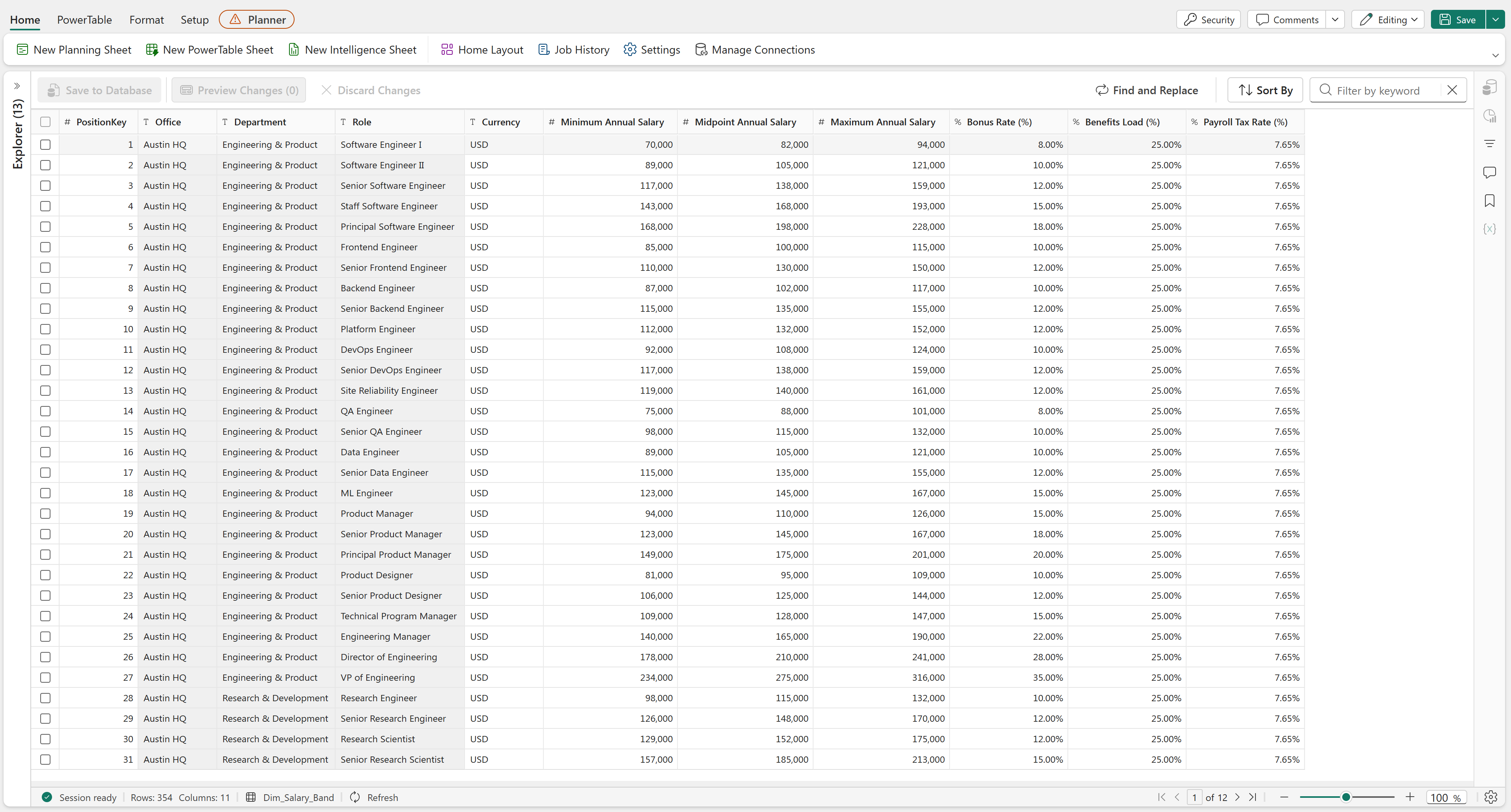
We used PowerTables for storing our reference tables for salary structure ranges and demand drivers:
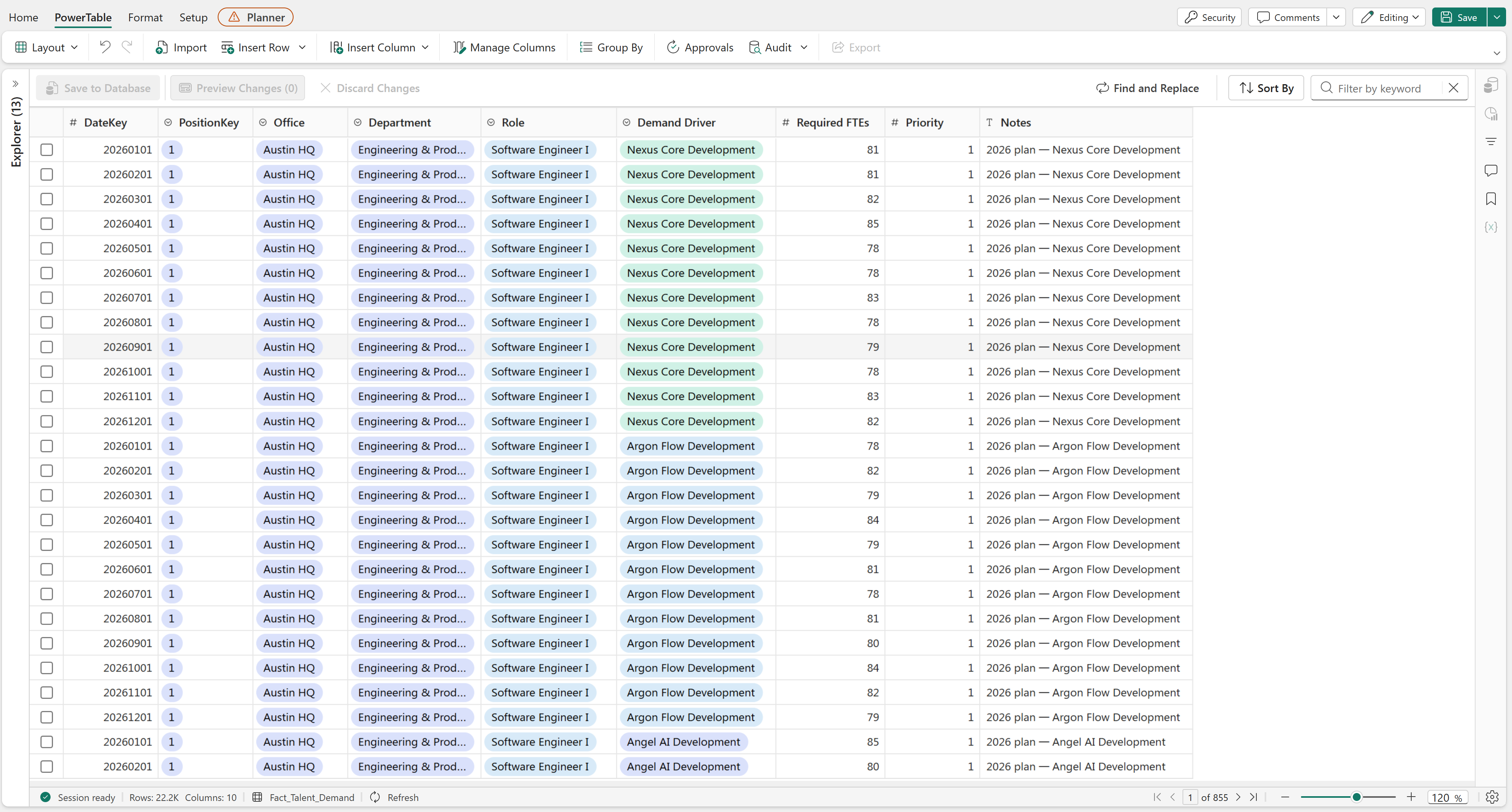
We were keen on governance, and wanted to make sure headcount owners could formally substantiate the reasons they wanted the FTEs they did. We achieved this by having them fill out forms which were connected to a PowerTable, with each submission restricting driver selection based on the particular role (we maintained bridge tables for demand drivers and roles, in PowerTable too):
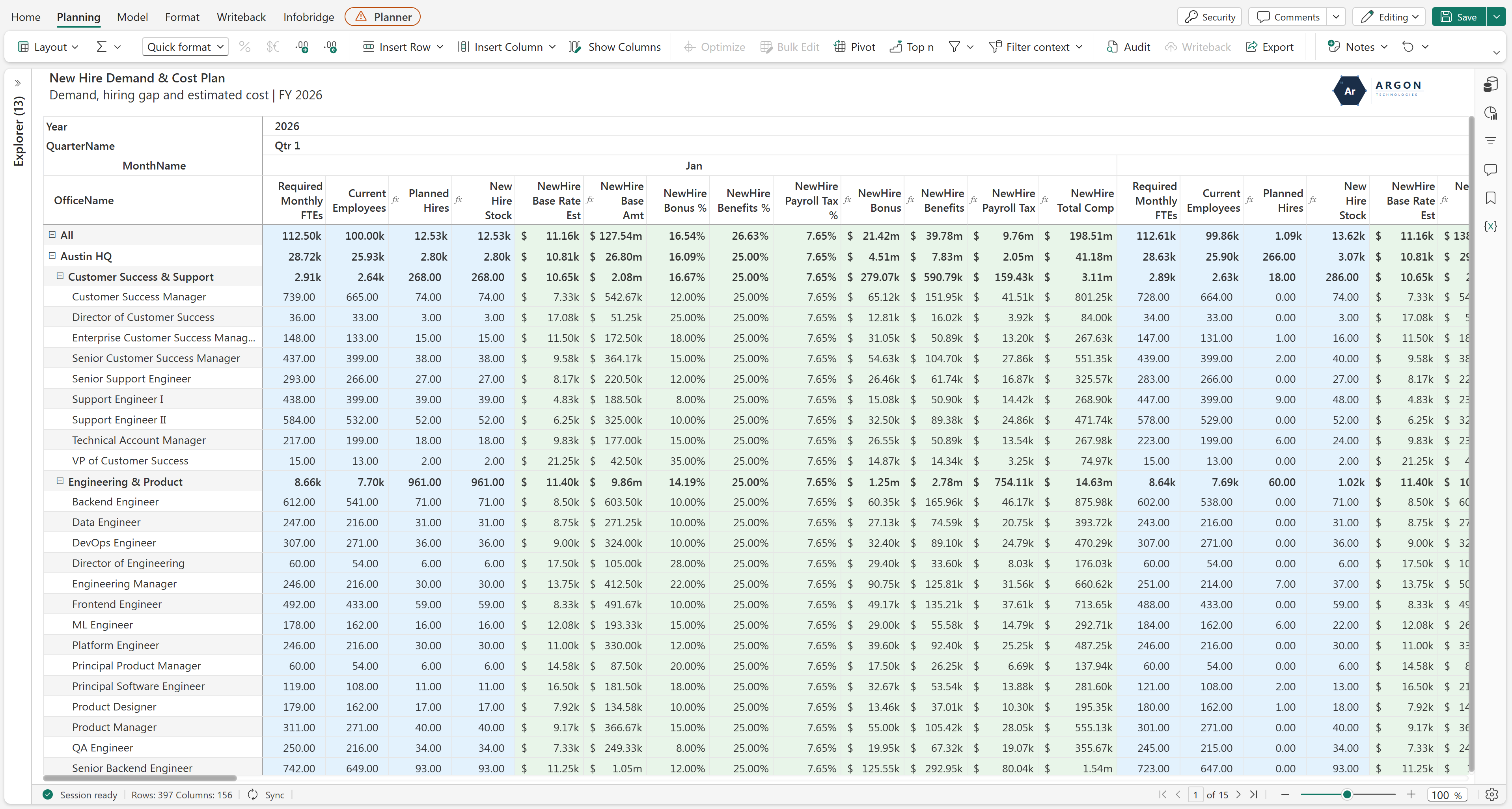
Next, we had a planning sheet that connected Layer 1's Current Employee PowerTable with this Layer's Demand Submission and Salary Reference PowerTables. We use formulae to evaluate the declared demand against existing supply and recent joiners, and automatically price the required hires:
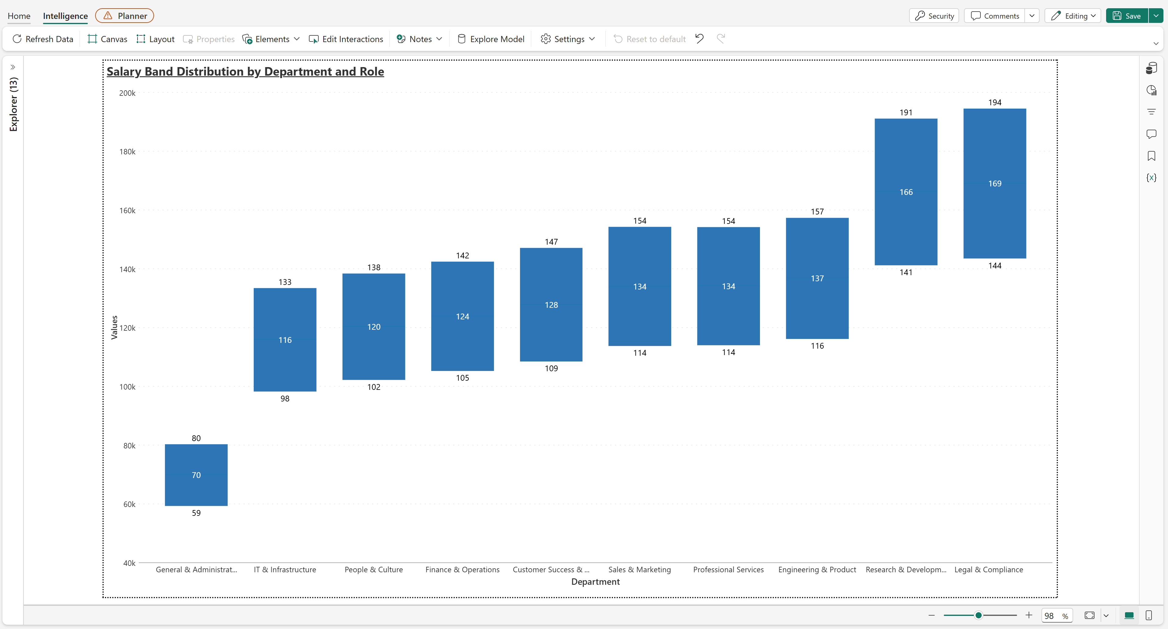
To wrap up this Layer, we also had a box plot chart which showed the way the min, mid and max points of each role's salary structure were spread out. We also had this drillable into the roles in each department:
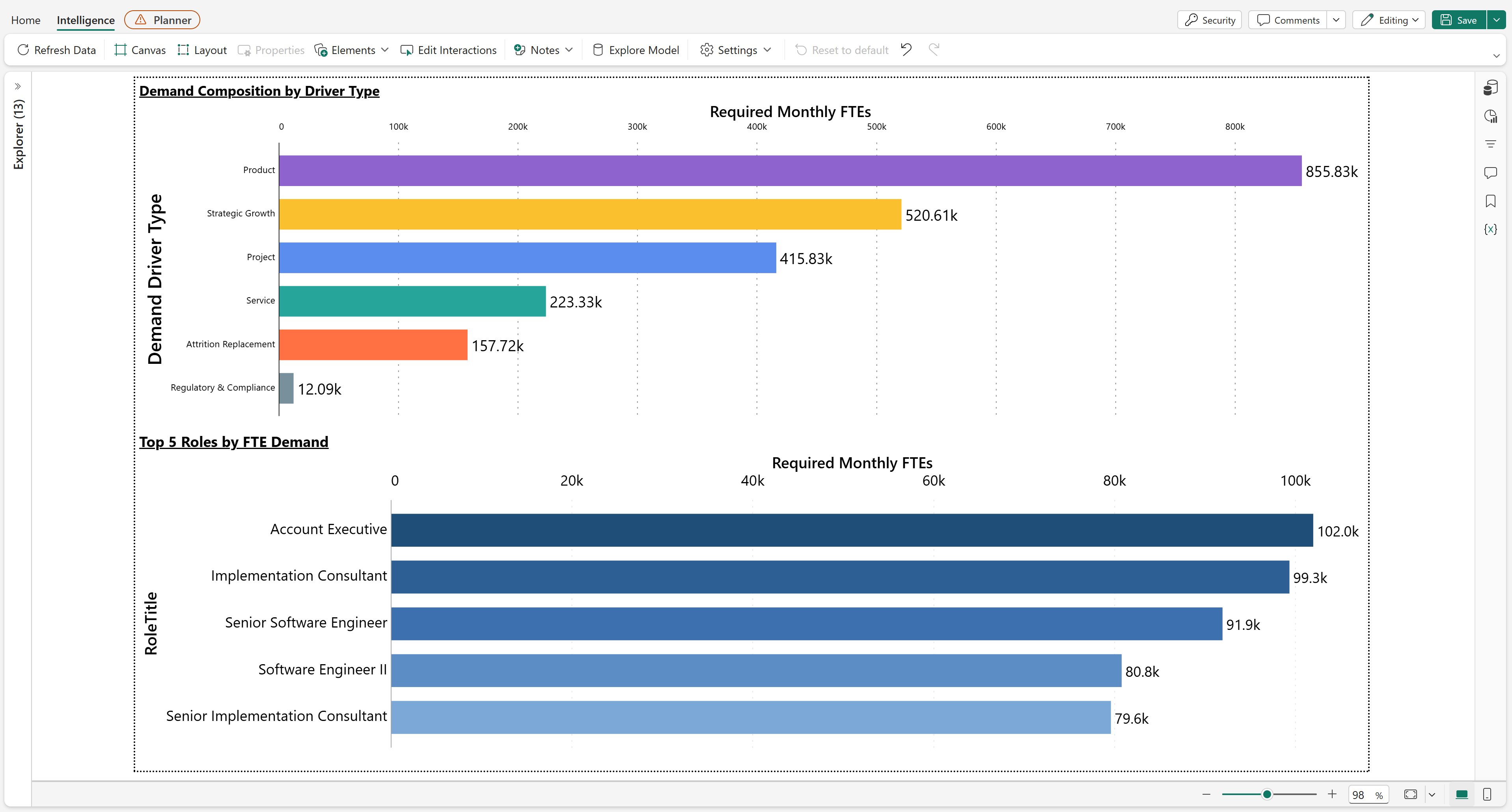
Alongside that, we also broke down demand by driver type and surfaced the roles carrying the most of it, which was useful for spotting whether a given period's hiring is mostly reactive backfill or actual strategic growth:
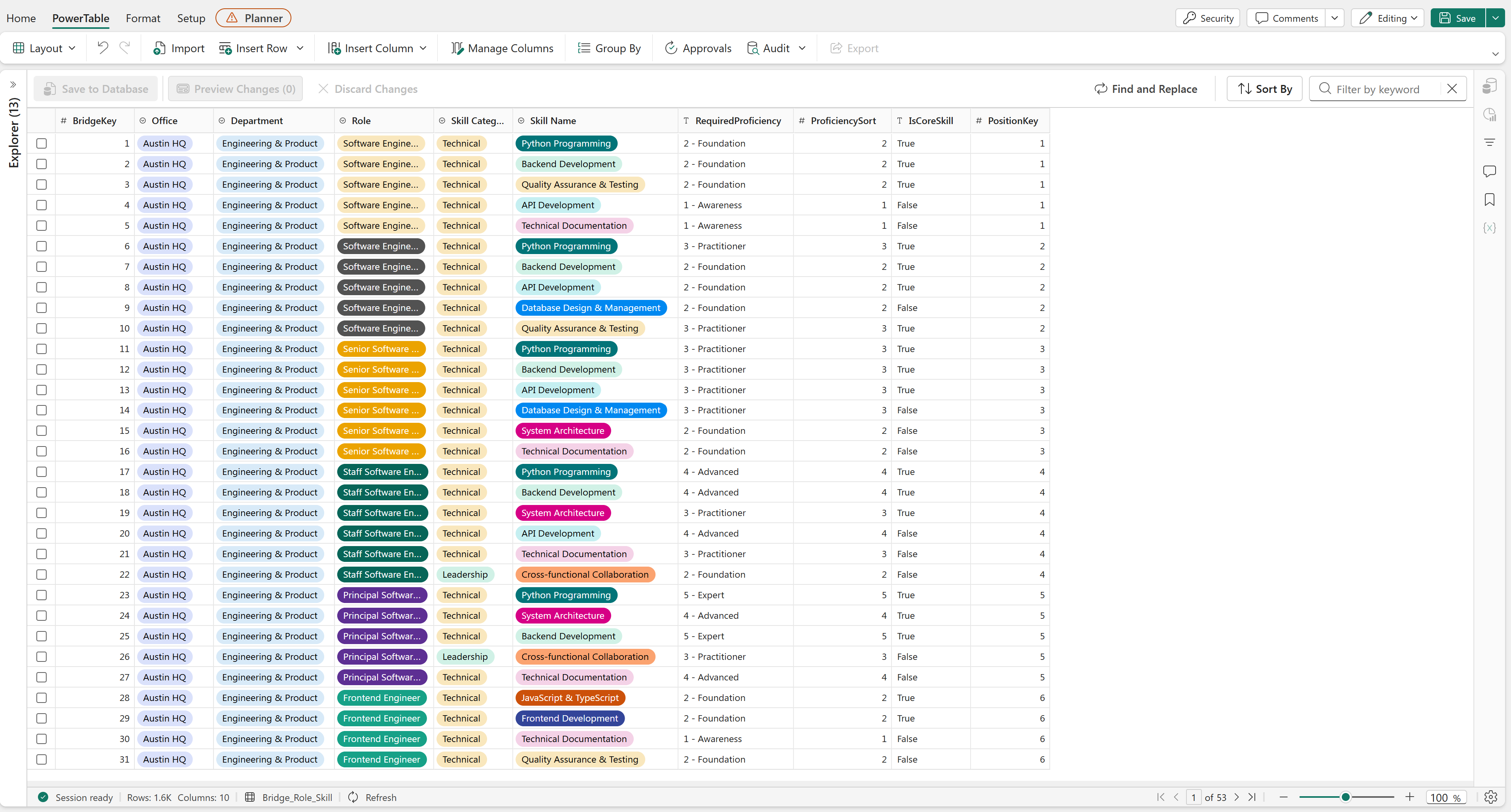
Back to the current workforce: Alongside just numerical headcount, we also wanted to monitor capability; how good each employee was at their role. We measure this, by having each role require a specific skillset (skillset being skills as well as proficiencies, so breadth and depth). PowerTables again for maintaining the reference tables, so we could map each role against standard proficiency benchmarks across five skill pillars (Technical, Functional, Leadership, Commercial, Delivery), using a 6-point scale from Awareness through Expert:
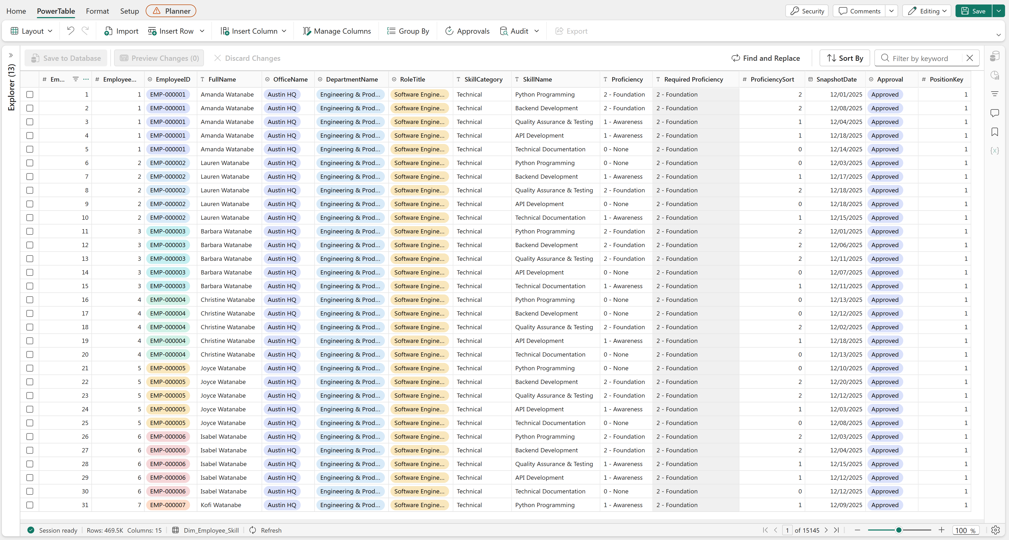
Headcount owners would use forms again to provide evaluations of their team members, which would flow through formal approval workflows before updating capacity metrics in a connected Planning Sheet (we weren't quite sure what formulae to use here, so we just used DAX):
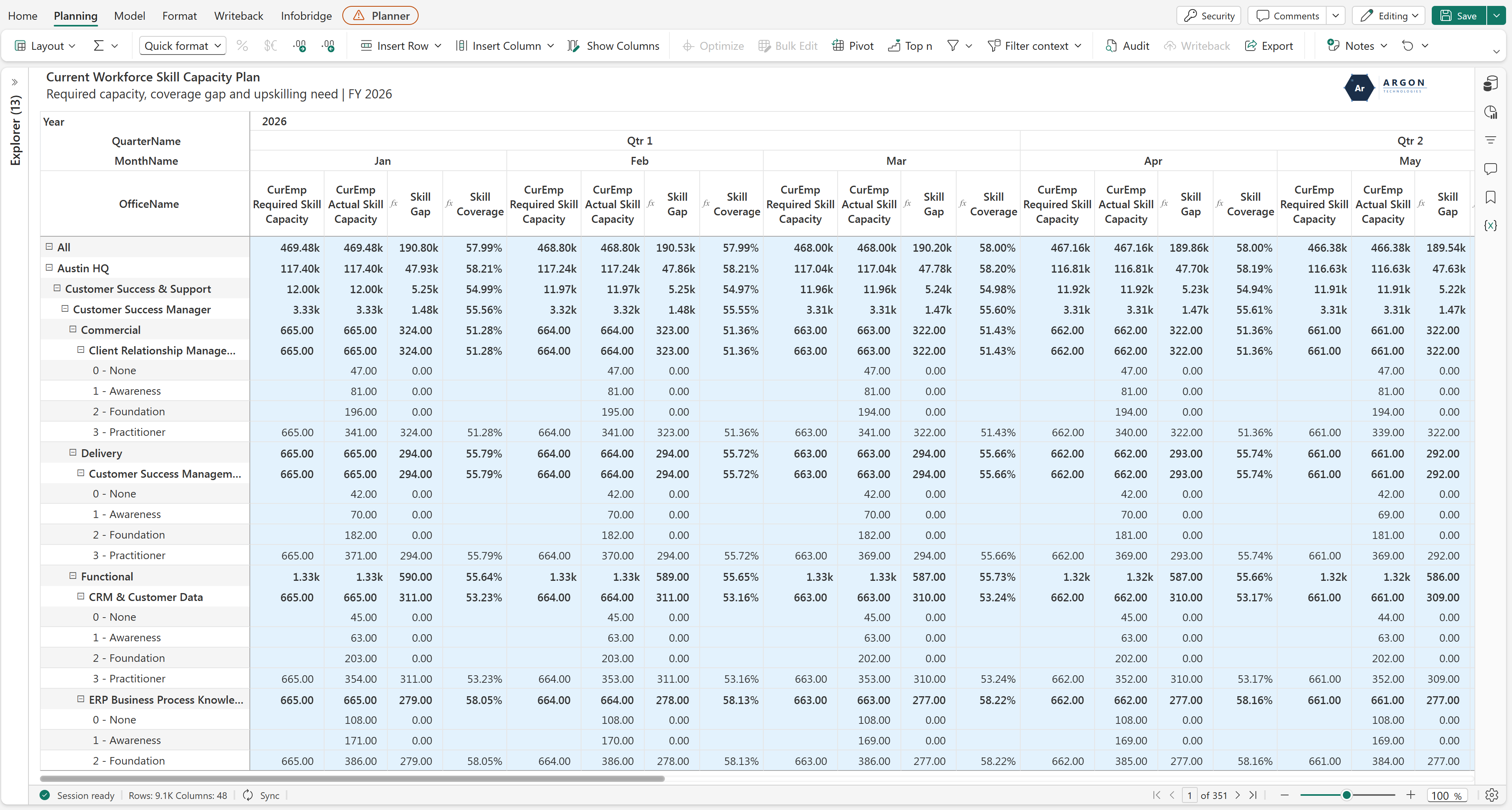
One metric gives us the benchmark while the other gives us the actual skill coverage, which would help us see which offices, departments and roles we need to drill into for upskilling:
We've also radar charts to highlight the average employee's skillset, against what their role actually requires.
The final layer unites current staff, new hires, and departures into a single executive view. With Layers 1 and 2 connected, we've a clear visibility into headcount movements (Opening + Hires − Attrition = Closing), drillable across offices, departments and roles, across the full planning horizon at whatever hierarchy of YQM we choose (and of course, salary structure and total cost as well):
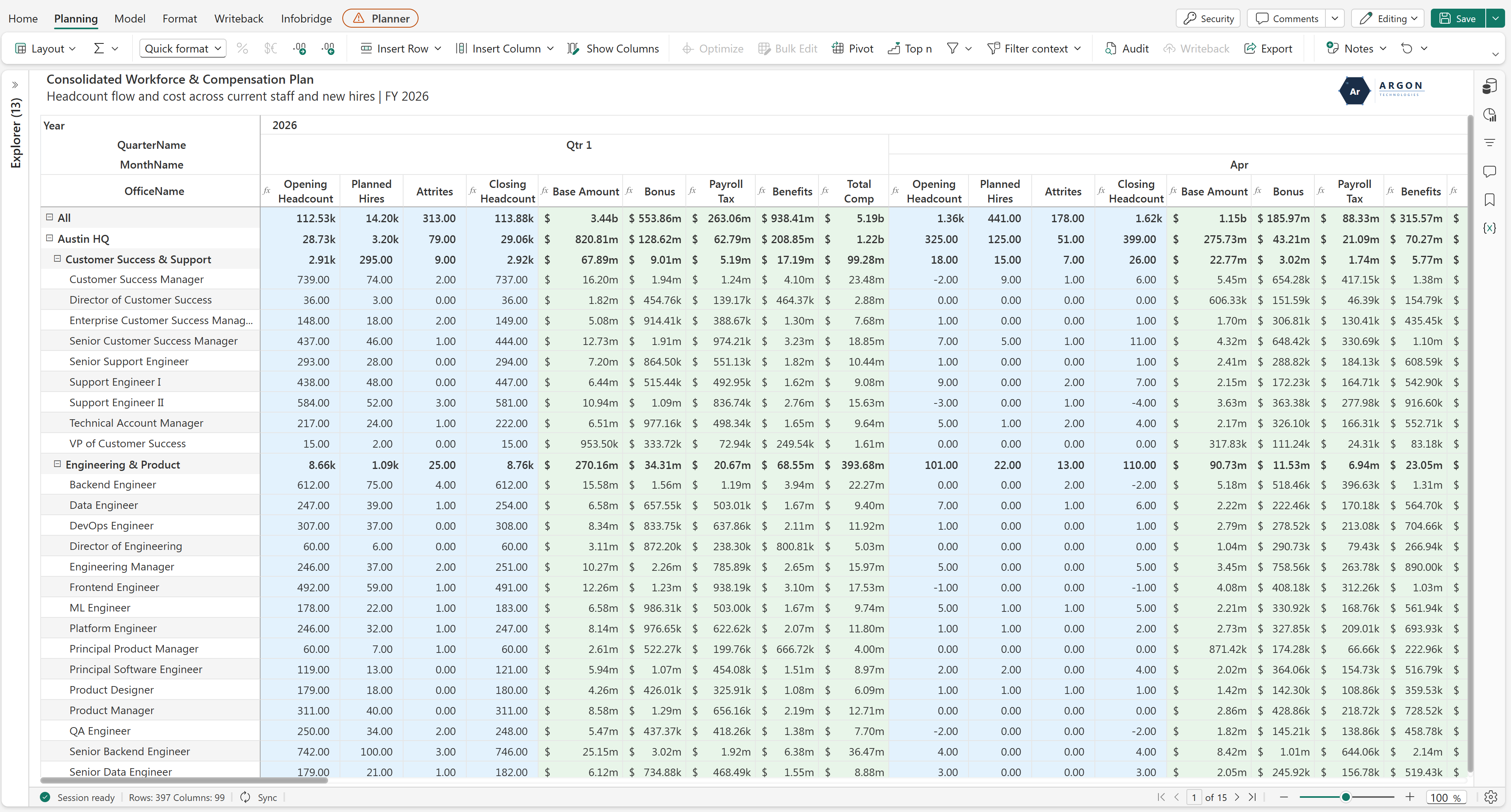
Was the ambition worth it? Yes, for the most part. We haven't phased out every spreadsheet in the process (a couple of departments still run side calculations we haven't fully folded into Layer 2 yet), but the core bet paid off. We get named-employee precision where it matters, aggregate speed everywhere precision doesn't apply, and none of it needs someone manually stitching four different sources together before a review. Well worth the initial setup time.
The part that's actually changed our week-to-week the most is that nobody asks “whose number is right” anymore. Compensation, demand, skill coverage, and the final headcount waterfall all trace back to the same four layers, so if something looks off, we know exactly which layer to go check instead of reconciling multiple spreadsheets to find it.
Thank you for reading this far. I posted the shorter version of this same question in the forum a while back, and if you're mid-way through building something similar, or you've got a finance team pushing back on named rosters, I'd like to compare notes in the forum.



Comments
0Please log in to comment.